Case Study: Process Improvement in Dry Cast Molding
In late 2000, Biocompatibles plc emerged from years of biomedical research in their laboratories outside London. One of their new products was a coating material that mimicked the hydration of the human cell. Applications of the new technology included coating stents used in angioplasty and coating contact lenses. Trials indicated that the stents coated with the new material were not rejected by the body as often as others. Contact lens users reported that they could wear the Biocompatibles-coated lenses a lot longer than standard lenses without drying out, fatigue or discomfort.
Based on the test results, the company decided that it was time to “go commercial” with their new material; to start to produce and sell stents and contact lenses treated with their new coating. Senior management further decided that their strategy for commercialization would be to implement a Six Sigma initiative; that Six Sigma would be the methodology they used to scale up and produce the new technology. I had the honor of teaching Dr. W. Edwards Deming’s principles and the Six Sigma methods and providing consulting assistance to the senior management team and to their initial project teams in their operations in England, Ireland and the U.S.
One of the first project teams was assigned to identify the major causes of rejected lenses after dry cast molding and then to introduce changes to the process to reduce the rate of rejects. Table A lists the number and percentage of lenses rejected for all reasons in lens dry inspection after the molding process. The data were drawn from 20 lots produced over a three-month period. Inspectors rejected any lenses that exhibited one or more of the following defects:
Miscount Scratch No lens Rough edges Chipped edge
Water spot Holes Torn Flow lines Bubbles
Surface chips Split edge Rust
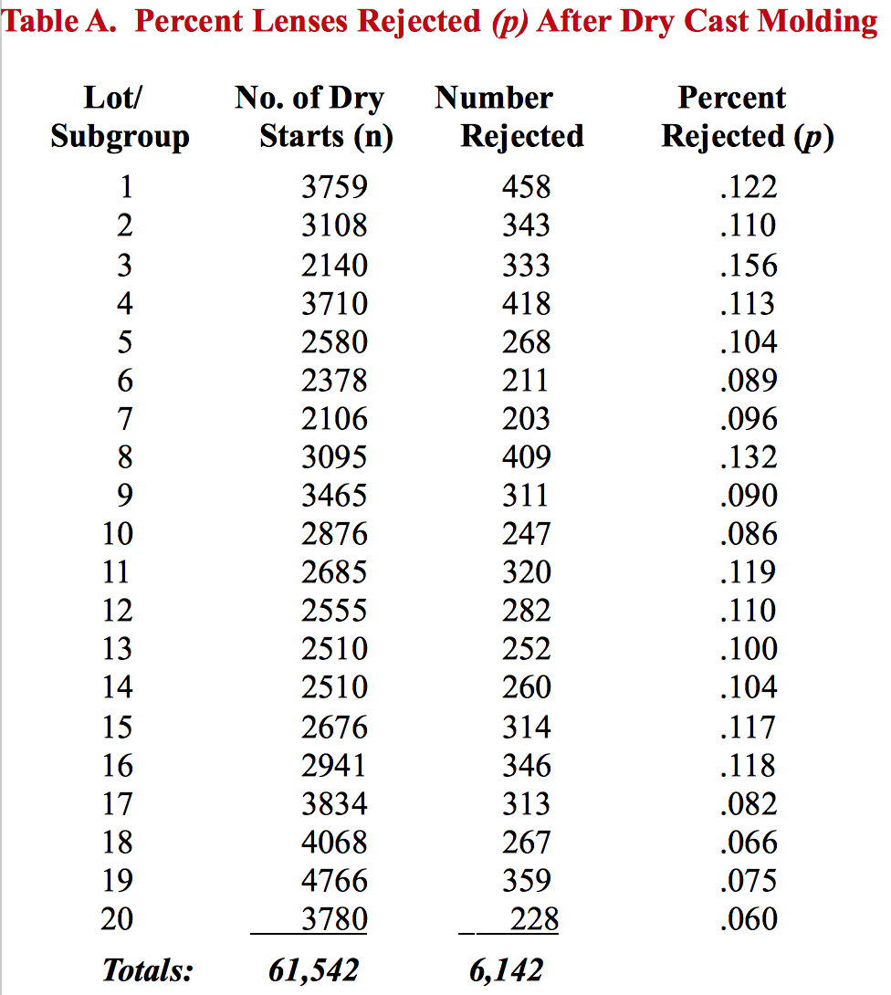
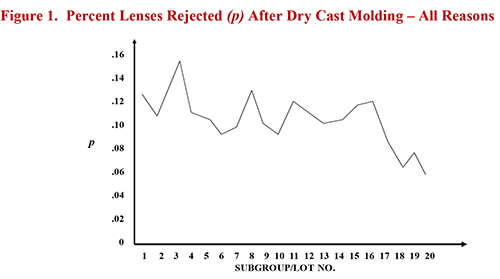
Figure 1 shows the run chart of the percent lenses rejected for any of the above reasons over the twenty selected lots. Because the lenses were produced in different-sized lots, it was appropriate to plot the percent lenses rejected (p) as opposed to the number of lenses rejected per lot. During the period represented by the data, the team had made several changes to the process. Causes of the defects were identified and corrective action was taken to eliminate or reduce the causes. Looking at their run chart, the team was pleased that their efforts had resulted in a downward trend in the percent lenses rejected throughout the summer.
The question, however, was not whether the rejects plotted in a downward trend. The question was whether there was a significant trend. The team proceeded to conduct a median test for non-random, special cause variation that they learned in my Essential Statistical Methods seminar. The trends test is summarized in Table B below.
Table B. Median Test for Non-Random, Special Cause Variation1
- Drawing a vertical line at the median of the points plotted will divide your chart into four quadrants, defined by the intersection of the median line and the central line (CL).
- Beginning in the upper right-hand quadrant, label the quadrants I through IV in the clockwise direction.
- Without counting any points on the median line or central line, total the number of points in the diagonal quadrants (I and III or II and IV) with the fewest number of points.
- Conclude there is a significant (non-random) trend if the total is equal to or less than the “critical value” below.
Number of Points
on Control Chart Critical Value
7 or less no test
8 – 11 0
12 – 14 1
15 – 17 2
18 – 20 3
21 – 23 4
24 – 25 5
26 – 28 6
29 – 31 7
32 – 33 8
34 – 36 9
37 – 38 10
39 – 41 11
42 – 43 12
44 – 46 13
47 – 48 14
49 – 51 15
52 – 53 16
54 – 56 17
57 – 58 18
59 – 60 19
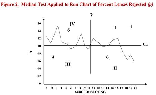
After the project team applied the trends test to their run chart, they ended up with the graph shown in Figure 2. Diagonal quadrants I and III had the fewest number of points on the graph, so the total of 8 was used as the test value. When they compared the test value to the Critical Value for 20 points shown on Table B above, the team discovered that the downward trend was not even close to being a significant trend (the test value of 8 was not equal to or less than the “critical value” of 3). Despite their best efforts, the test did not indicate that they had significantly reduced the level of rejects.
Needless to say, the project team was extremely disappointed that all of their work – and the apparent downward trend in rejects – did not result in a significant trend. They were ready to give up! I urged them not to give up yet and suggested that they plot their data on a p Chart (for percent or proportion defective). What if, versus the p Chart control limits, their most recent lots’ percent rejected was not low, but was significantly low? Might the p Chart deliver the good news they had hoped to get from the trends test?
The p chart is particularly useful in a setting like the dry cast molding process for two reasons.2 First, because of the complexity of its dry cast molding process, the team couldn’t “stack the deck” to process an equal number of contact lenses in every lot or batch. Different lots had very different numbers of lenses. The p chart, however, allows one to take the data as they come, with no need to manipulate the measurements into standard samples or subgroups of equal size.
Second, the p chart automatically factors in how the same number of incidents will naturally have a different impact as a percentage on samples of different sizes. For example, in a department of ten employees, if one is absent we have a percent absenteeism rate of ten percent. In a group of twenty employees, one absence produces a percent absenteeism rate of only five percent.
The same number of incidents has a very different percentage impact on small groups versus large groups. In education, this is one reason small schools or classes live in fear when district report cards of standardized test scores are published by the central office. If you’re a small school, you don’t need many kids to score below grade level to look terrible as a percentage!
By the same token, over the three-month period reflected in this study, some lots had as few as 2,100 lenses while another had over 4,800 lenses. It would be neither fair nor rational to compare such different-sized groups on a strict percentage basis (even though too many managers and auditors do it all the time). The p chart automatically factors in the reality of higher impacts as percentages on smaller groups.
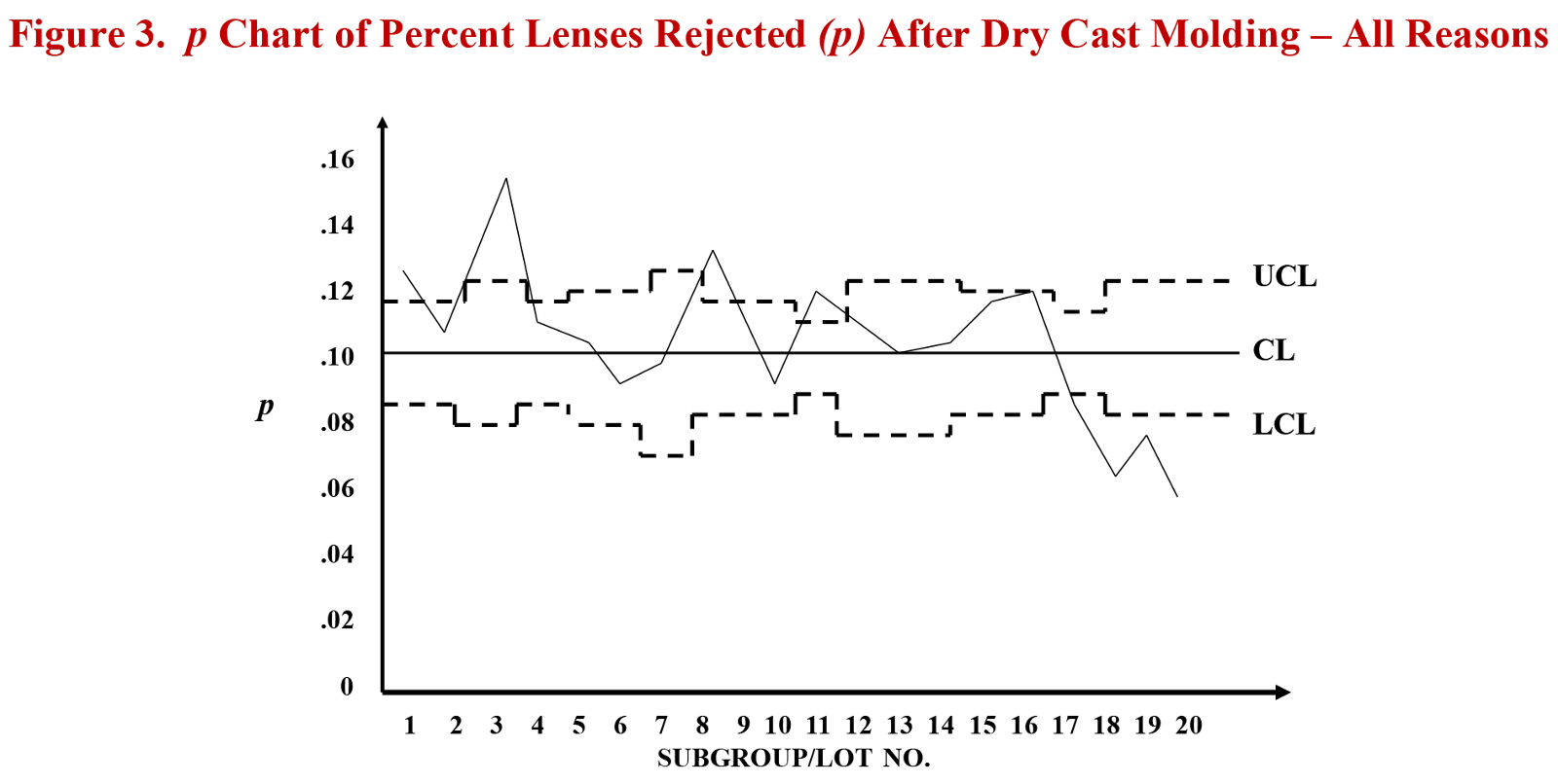
Table C below shows the calculations of the central line and control limits and Figure 3 under the table provides the resulting p Chart. You will see that the process was not stable during the period represented by the data. Some of the percent rejected rates were above the upper control limit (UCL) early in the summer and the most recent lots’ reject rates plotted significantly low (below the lower control limit or LCL). The project team was pleased to see that their efforts were indeed successful; they had improved the process; they had accomplished a statistically significant reduction in the percentage of lenses rejected after dry cast molding.
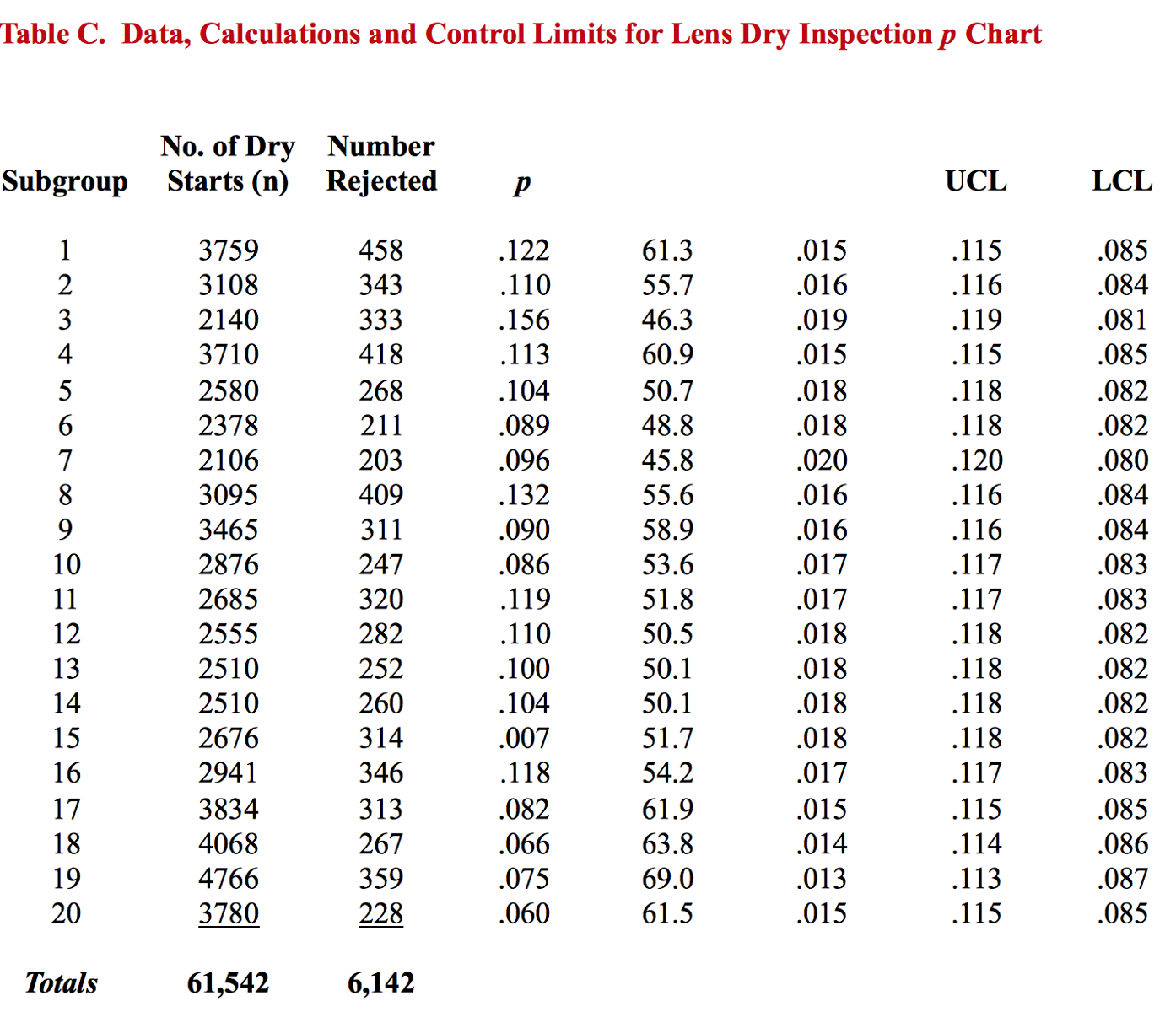
Central Line (CL) = p-bar = Total No. of Defectives = 6,142 = .010
Total No. of Samples 61,542
For too many Six Sigma projects, teams would be directed to now address the "Control" phase of DMAIC (Define-Measure-Analyze-Improve-Control). That is, they would be encouraged to establish "control" at the improved level of performance. I base all of my work on the teachings of Dr. W. Edwards Deming, and Point 5 of Deming's 14 Points for Management reads, "Constantly and forever improve every process for planning, production and service." Therefore, I advised the team to forget the Control phase! I did not want them to establish control at the current (though improved) level of defectives. I urged them (as I urge all of my clients) to institutionalize improvement so the reduction in defectives would continue in the wake of their successful project.
KISS Principle
When the data were first collected on the lenses rejected in lens dry inspection, the Quality Director asked me to help them plot each defect on separate control charts. He believed it was important to monitor the different failure modes or rejects separately. Recall that there were 13 different defect types that would result in a lens being rejected. Further recall that different production lots had different numbers of lenses. So, to fulfill the Quality Director’s request the team would have had to set up and maintain thirteen separate u Charts (for rate of defects) – one for each defect.
I counseled the Quality Director against his original plan. No matter what defect was discovered in lens dry inspection, the lens was rejected; the defect resulted in a defective. Therefore, I recommended that the team throw all rejected lenses into one bucket and plot the data on the above p Chart. The project team then backed up their control chart with the color-coded stacked bar chart shown in Figure 4 below.
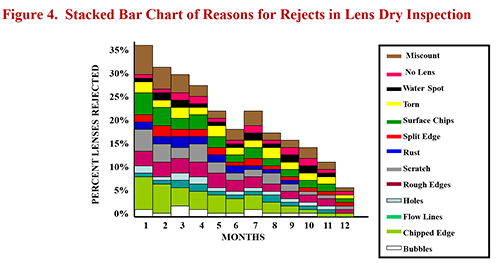
Viewing the defects summary in Figure 4, one can see that it’s not necessary to construct 13 separate u Charts to see that miscounts and chipped edges were the major reasons for rejects in November 2000. The project team didn’t need these failure modes plotted on separate control charts to know that there was a greater need to attack and eliminate causes of chipped edges than missing lenses (the “no lens” defect).
When employing statistical process control, readers are encouraged to always follow the “KISS” principle – keep it statistically simple! Don’t try to maintain several control charts when one will do the job. If a defect or failure mode results in a total reject, plot the rejects on a p Chart or, for constant subgroup sizes, the np Chart. Then, back up the control chart with a Pareto diagram or, as used in this case, a stacked bar chart. The simple tool will let you know the priorities for short-term action and the control chart will let you analyze the longer-term effects of your efforts to improve the process.
Case Summary
As noted earlier, the data used for the control chart in this study were drawn from production lots molded and tested over a three-month period. The data summarized in Figure 4, however, cover the lens dry inspection results for the first twelve months of the U.S. plant’s operations. It’s impressive to see how the training, projects and leadership drove first pass yields up from 65% in the first month to 94% in month 12. Even more impressive is that this unquestioned progress was achieved during the same period of time that the plant went from two cast molding lines to nine cast molding lines; from 85 direct-labor employees to 320 direct-labor employees; from shipping 200,000 packaged contact lenses a month to shipping more than 1.6 million lenses a month.
It’s one thing to apply powerful statistical methods to accomplish improvements when working with a steady, mature process. It’s quite another thing to accomplish an improvement from 65% yields to 94% yields during the same period that you experience a four- to eight-fold increase in production capacity, employment and shipping levels. Many Biocompatibles managers and employees played a part in the results documented in this case. I was pleased and honored to have had the opportunity to work with them and grateful for the following comments and recommendation from a Biocompatibles executive:
“Jim has run a number of highly effective training sessions and consultancy exercises for us, based on the continuous improvement principles of Dr. W. Edwards Deming. He is a highly motivating and energetic trainer who has the skill to assist people to translate the theories into concrete action that delivers real results. Very highly recommended.” — Geoff Tompsett, HR and IT Manager, Biocompatibles plc.
Notes
1K. Ishikawa, Guide to Quality Control, Asian Productivity Organization, Tokyo, Japan (1986), p. 217.
2J.F. Leonard, The New Philosophy for K-12 Education: A Deming Framework for Transforming America's Schools, ASQ Quality Press, Milwaukee, WI (1996), pp. 136-137.
© 2013 James F. Leonard. All rights reserved.